I started this journey with a simple but ambitious goal: learn computer vision from scratch by implementing MNIST digit recognition using nothing but Excel. No ML libraries, no pre-built solutions - just me, spreadsheets, and mathematical reasoning.
Why Excel? Because it forces me to understand every single operation. When you can't import TensorFlow or scikit-learn, you have to actually understand what "similarity" means, what "features" are, and how classification works at a fundamental level.
The question driving me: "What does it really mean to recognize a handwritten digit?"
My first task was understanding what an image actually is mathematically. I had a dataset of handwritten digits (the MNIST dataset) organized in folders by digit class. After reorganizing the messy folder structure, I picked three images of the digit "3" to start with.
I wrote a Python script to convert JPG images to CSV files - transforming visual data into pure numbers. Each 28×28 pixel image became a grid of 784 numbers ranging from 0 (black/background) to 255 (white/foreground).
The magical moment: When I imported the CSV into Excel and applied conditional formatting with a color scale, the digit "3" appeared as a heatmap!
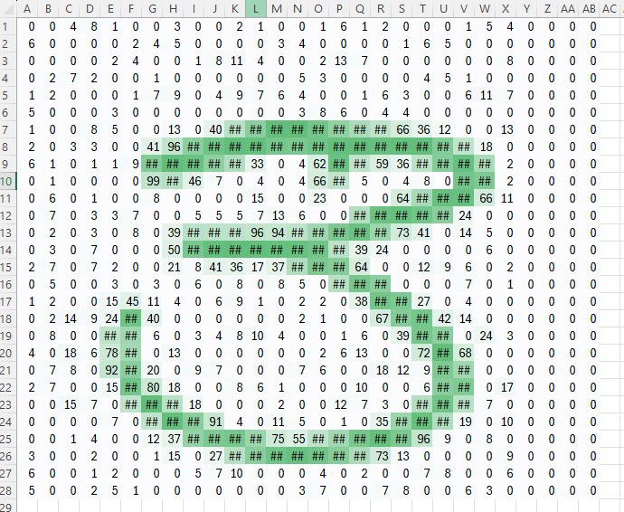
My first "3" in Excel - numbers transformed into a visual pattern through conditional formatting. Green cells (high values 200-255) show the pen stroke, while low values (0-50) show the background.
I could literally see the shape emerging from the numbers. This simple visualization gave me a profound insight: images are just arrays of numbers. Computer vision is number analysis.
Looking at row 7 in the grid, I could see the pixel values rising from 0 → 40 → peak → descending back to 0, tracing the curve of the digit. Each number told a story about where the pen touched the paper.
Looking at the numbers, I started thinking: how would I tell if an unknown image is a "3" versus some other digit?
My intuition: similar images should have similar pixel values. If I have two images of "3", their numbers should be close. A "3" and an "8" should have very different numbers.
My hypothesis formed:
Take two images and subtract them pixel-by-pixel
Calculate the absolute differences
Take the average of all differences
Lower average = more similar images
Prediction: Comparing two "3"s should give a LOWER average difference than comparing a "3" to an "8".
This felt logical. Two variations of the same digit should be more similar to each other than to completely different digits. Right?
I set up two tests in Excel:
Test 1: Compare two "3" images
img_7 (digit 3) vs img_139 (also digit 3)
Subtracted corresponding cells: =ABS(img_7!A1 - img_139!A1)
Copied formula across entire 28×28 grid
Calculated average of all differences
Test 2: Compare "3" and "8" images
img_7 (digit 3) vs img_20 (digit 8)
Same subtraction process
Calculated average
I was confident. Two "3"s should clearly be more similar than a "3" and an "8".
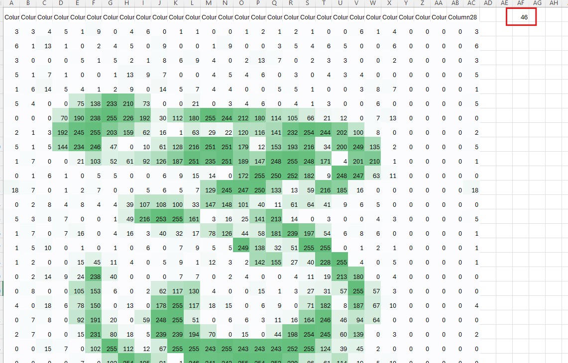
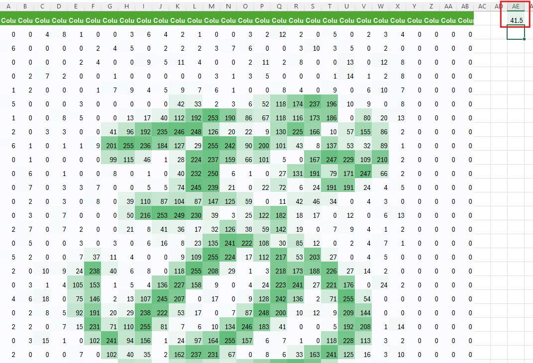
Top: The 3 vs 8 comparison with average = 41.5. Bottom: The 3 vs 3 comparison with average = 46. Wait, what?!
Test 1 (3 vs 3): Average difference = 46 Test 2 (3 vs 8): Average difference = 41.5
I stared at the screen in disbelief. According to my metric, a "3" is MORE similar to an "8" than to another "3"!
This made no sense. I double-checked my formulas. I recalculated. The math was correct, but the result violated my intuition completely.
My hypothesis had failed spectacularly.
I looked at both difference grids side by side. The 3 vs 8 comparison showed concentrated regions of high differences - the shapes were clearly different, but in predictable ways. The 3 vs 3 comparison puzzled me more - there were differences scattered throughout, even though both were the same digit.
Then I placed the two "3" images side-by-side for visual comparison:

Two different handwritten "3"s - notice the thickness and position differences that caused my algorithm to fail.
The revelation hit me immediately.
Discovery #1: Stroke Thickness
The top "3" (img_7) had a thin, delicate stroke
The bottom "3" (img_139) had a much thicker, bolder stroke
The thicker "3" started from column D, while the thin one started later
Discovery #2: Pixel Intensity Variations
Even where both images had strokes in the same location, the pixel values were drastically different:
Thin stroke: pixel value = 150
Thick stroke: pixel value = 250
Difference: |150 - 250| = 100 (huge!)
And where the thick stroke extended beyond the thin one:
Thin stroke: 0 (no ink yet)
Thick stroke: 200
Difference: 200 (massive!)
These large differences accumulated across the entire image, driving up the average to 46.
I had discovered something critical: pixel-wise comparison is extremely sensitive to variations that don't affect human recognition.
When I look at both "3"s, my brain instantly recognizes them as the same digit despite:
Different stroke thickness (pen pressure)
Slight position variations (starting column)
Different pixel intensities (ink darkness)
Different writing styles (curves vs angles)
But my simple pixel-subtraction algorithm can't see past these surface differences.
The algorithm is measuring the wrong thing. It's asking "are the pixels identical?" when it should be asking "is the shape similar?"
This puzzle had an explanation too. Looking at the difference grid for 3 vs 8, I noticed the high-value differences (green cells showing 200-255) appeared in distinct, concentrated regions where one digit had a stroke and the other didn't.
The "3" and "8" comparison happened to have:
More similar stroke thickness by chance
Different shapes occupying different spatial regions
Less overlap in certain areas, which paradoxically reduced some pixel-level conflicts
Complementary positioning that led to a lower average
The metric was giving misleading results because it treats all differences equally, regardless of their semantic meaning.
This "failed" experiment taught me more than a successful one would have:
Raw pixel comparison is too brittle - It's overly sensitive to thickness, position, intensity, and style - factors humans ignore effortlessly.
Averages can be misleading - A single summary number loses critical spatial information about WHERE and WHY differences occur.
Human vision is sophisticated - We unconsciously normalize for thickness, position, rotation, and style. Computer vision algorithms must do this explicitly through preprocessing and feature engineering.
The problem is harder than it looks - What seems trivial to a 5-year-old (recognizing a "3" is a "3") requires sophisticated mathematical approaches to automate.
Failure reveals truth - My wrong hypothesis exposed the fundamental challenges of translation invariance, scale invariance, and style invariance in computer vision.
I'm now at a critical juncture. My naive approach failed, but the failure illuminated potential solutions:
Directions to explore:
Normalization: Adjust all images to have consistent total intensity or stroke thickness before comparison
Binary thresholding: Convert to simple black/white (1 or 0) to ignore intensity variations - only care WHERE strokes exist, not HOW DARK they are
Structural features: Extract higher-level features like "number of loops," "endpoints," "curves," or "symmetry" rather than comparing raw pixels
Better distance metrics: Explore alternatives to simple pixel-wise subtraction
Alignment preprocessing: Center all digits at the same position before comparison
Profile signatures: Compare row/column intensity distributions instead of individual pixels
Each of these approaches addresses a specific weakness I discovered in my first experiment.
Today I learned that discovery-based learning means embracing failure as a teacher. My hypothesis was wrong, but the investigation revealed fundamental challenges in computer vision that professional researchers spend careers solving.
I experienced the power of hands-on experimentation. Reading about "translation invariance" or "feature engineering" in a textbook is abstract. Watching your own carefully-reasoned hypothesis fail because two "3"s have different stroke thickness - that's concrete. That's memorable. That creates understanding.
The journey from "images are numbers" to "naive pixel comparison fails" took just one afternoon, but the insights will shape everything that comes next.
Computer vision isn't about having the right algorithm handed to you. It's about:
Asking questions ("How can I measure similarity?")
Forming hypotheses ("Average pixel difference should work")
Testing rigorously (actual calculations in Excel)
Being surprised by results (3 vs 3 scored worse than 3 vs 8!)
Investigating failures (thickness and position matter!)
Iterating toward solutions (normalization, features, better metrics)
I'm not discouraged by today's failed hypothesis. I'm energized. Because now I know exactly what problems need solving, and I have concrete experimental evidence guiding me toward solutions.
The digit "3" looks simple on paper. But making a computer understand "three-ness" requires grappling with variation, invariance, representation, and measurement. These aren't just academic concepts - they're real barriers I hit today with real data.
Next session: I'll explore normalization techniques and feature extraction to build a more robust similarity measure. The goal remains: understand digit recognition from first principles, one experiment at a time.
Each failure brings me closer to understanding what professional computer vision systems must handle: the infinite variety of human handwriting, captured in 784 simple numbers.
Spark optimization isn't always complex; some tweaks have a huge impact. Inferring schemas forces Spark to scan your data twice, slowing ingestion and inflating cost. Explicit schemas avoid the extra pass and make pipelines faster and cheaper.

Cricket is no longer just a game of "gut feelings." This blog uncovers how hidden metrics like Expected Wickets and "Ghost" simulations are winning matches before the first ball. Dive into the high-stakes world where data science meets the 22 yards to redefine the sport.

Passed the Databricks Gen AI Associate Certification with 56 questions in 90 minutes! Here's my honest experience, preparation strategy, time management tricks, and the exact resources that helped me succeed. Real insights for aspiring certificants.

A practical walkthrough of how I reduced heavy batch workloads using Change Data Feed (CDF) in Databricks. This blog shows how CDF helps process only updated records, cutting compute costs and boosting pipeline efficiency.

I dropped a table in Snowflake, then queried to verify it was gone. The system said it doesn't exist, but also showed it consuming 3.57 MB. That contradiction led me down a rabbit hole of metadata delays, missing commands, and hidden costs. Here's what I discovered.

The AI industry has a security problem: data scientists aren't trained in security, ML engineers are working with black-box models, and security pros don't understand GenAI. Learn about the frameworks and tools bridging this gap—from Llama Guard to Databricks' safety features.

Why DELETE isn’t enough under GDPR, and how Time Travel can make sensitive data reappear unless VACUUM is used correctly.

This blog shares my personal journey into Snowflake Gen AI, from early confusion to hands-on clarity. It offers practical study tips, common pitfalls, and guidance to help you prepare effectively and understand Snowflake’s evolving AI capabilities.

Started scrolling Instagram at 2 AM. Saw Cloudflare memes. Fell down a 4-hour research rabbit hole. Discovered that AND database = 'default' could have prevented the whole thing. My sleep schedule is ruined but at least I understand distributed systems now.

Discover the top 10 data pipeline tools every data engineer should know in 2025. From Airflow to Fivetran, learn how each tool powers modern data workflows, supports real-time analytics, and scales across cloud ecosystems.
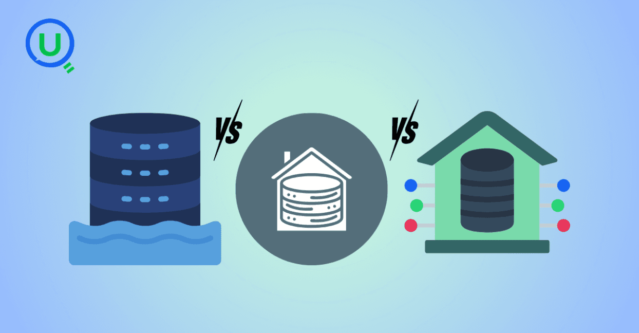
Confused between a data lake, data warehouse, and data mart? Discover key differences, real-world use cases, and when to use each architecture. Learn how to build a modern, layered data strategy for scalability, governance, and business insights.

Explore what syntax means in the world of data and AI—from SQL and Python to JSON and APIs. Learn why syntax matters, common errors, real-world examples, and essential best practices for data engineers, analysts, and AI developers in 2025.
Discover how AWS Data Pipeline helps automate data movement and transformation across AWS services like S3, Redshift, and EMR. Learn its key features, benefits, limitations, and how it compares to modern tools like AWS Glue and MWAA.

Learn how to build scalable and secure data pipeline architectures in 2024 with best practices, modern tools, and intelligent design. Explore key pillars like scalability, security, observability, and metadata tracking to create efficient and future-proof data workflows.
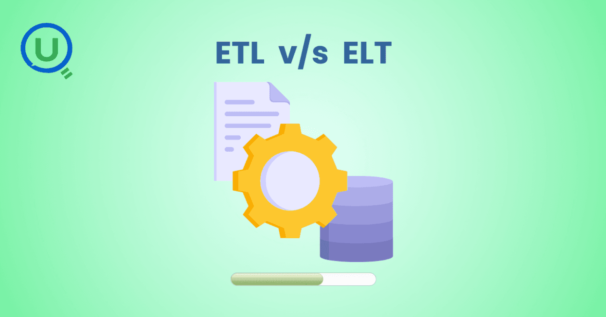
Explore the key differences between ETL and ELT data integration methods in this comprehensive guide. Learn when to choose each approach, their use cases, and how to implement them for efficient data pipelines, real-time analytics, and scalable solutions.
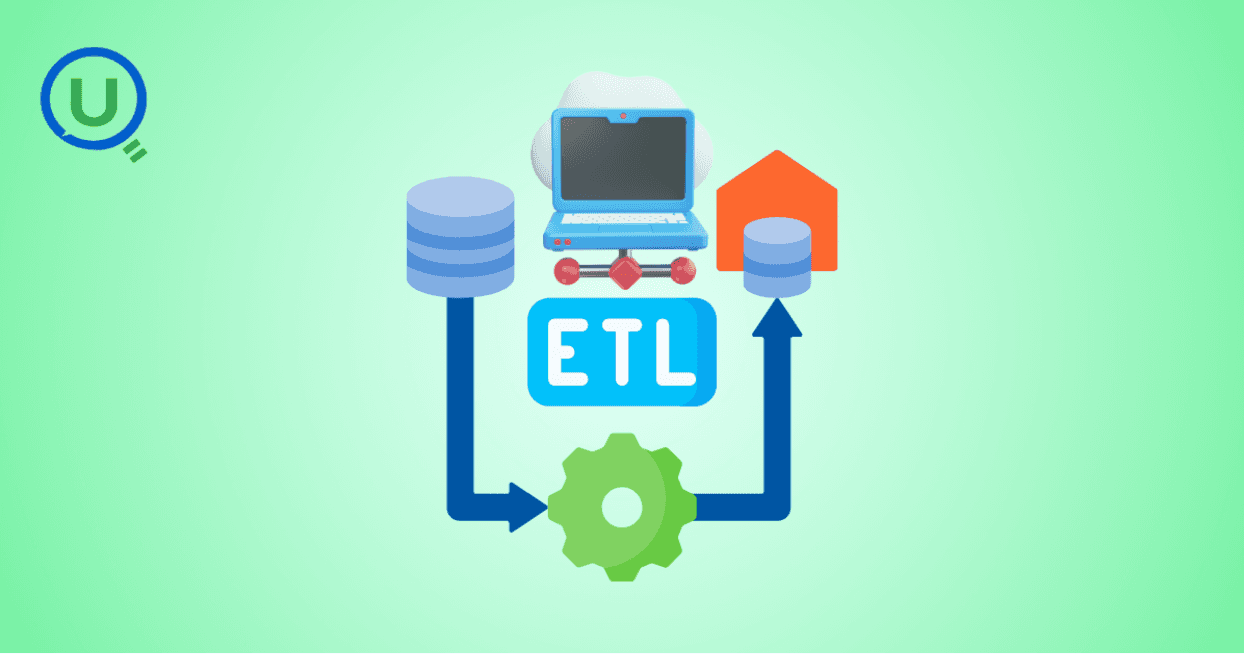
Learn the essential role of ETL (Extract, Transform, Load) in data engineering. Understand the three phases of ETL, its benefits, and how to implement effective ETL pipelines using modern tools and strategies for better decision-making, scalability, and data quality.

Discover why data orchestration and analysis are essential for modern data systems. Learn how automation tools streamline data workflows, boost insights, and scale with your business

Learn what a data ingestion pipeline is, why it's vital for modern analytics, and how to design scalable, real-time pipelines to power your data systems effectively.

Discover the top 15 data warehouse tools for scalable data management in 2024. Learn how to choose the right platform for analytics, performance, and cost-efficiency.

Confused between a data mart and a data warehouse? Learn the key differences, use cases, and how to choose the right data architecture for your business. Explore best practices, real-world examples, and expert insights from Enqurious.

Discover the top 10 predictive analytics tools to know in 2025—from SAS and Google Vertex AI to RapidMiner and H2O.ai. Learn why predictive analytics is essential for modern businesses and how to choose the right tool for your data strategy.

Explore the key differences between descriptive and predictive analytics, and learn how both can drive smarter decision-making. Discover how these analytics complement each other to enhance business strategies and improve outcomes in 2025 and beyond.

Explore the key differences between predictive and prescriptive analytics, and learn how both can drive smarter decisions, enhance agility, and improve business outcomes. Discover real-world applications and why mastering both analytics approaches is essential for success in 2025 and beyond.

Compare PostgreSQL vs SQL Server in this comprehensive guide. Learn the key differences, strengths, and use cases to help you choose the right database for your business needs, from cost to performance and security.

Learn what Power BI is and how it works in this beginner's guide. Discover its key features, components, benefits, and real-world applications, and how it empowers businesses to make data-driven decisions.

Explore what a Business Intelligence Engineer does—from building data pipelines to crafting dashboards. Learn key responsibilities, tools, and why this role is vital in a data-driven organization.

Discover why data lineage is essential in today’s complex data ecosystems. Learn how it boosts trust, compliance, and decision-making — and how Enqurious helps you trace, govern, and optimize your data journeys.

Learn what a data mart is, its types, and key benefits. Discover how data marts empower departments with faster, targeted data access for improved decision-making, and how they differ from data warehouses and data lakes.

Master data strategy: Understand data mart vs data warehouse key differences, benefits, and use cases in business intelligence. Enqurious boosts your Data+AI team's potential with data-driven upskilling.

Learn what Azure Data Factory (ADF) is, how it works, and why it’s essential for modern data integration, AI, and analytics. This complete guide covers ADF’s features, real-world use cases, and how it empowers businesses to streamline data pipelines. Start your journey with Azure Data Factory today!
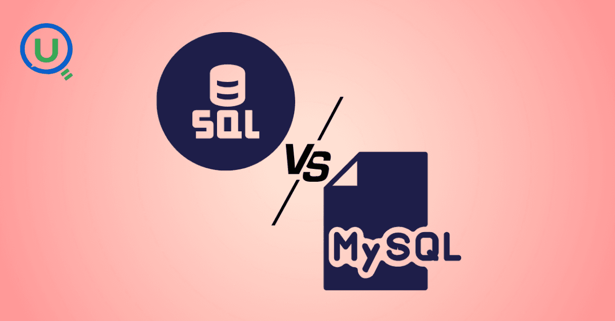
Discover the key differences between SQL and MySQL in this comprehensive guide. Learn about their purpose, usage, compatibility, and how they work together to manage data. Start your journey with SQL and MySQL today with expert-led guidance from Enqurious!
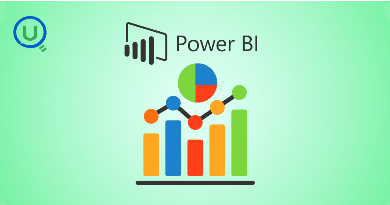
Learn Power BI from scratch in 2025 with this step-by-step guide. Explore resources, tips, and common mistakes to avoid as you master data visualization, DAX, and dashboard creation. Start your learning journey today with Enqurious and gain hands-on training from experts!

AI tools like ChatGPT are transforming clinical data management by automating data entry, enabling natural language queries, detecting errors, and simplifying regulatory compliance. Learn how AI is enhancing efficiency, accuracy, and security in healthcare data handling.
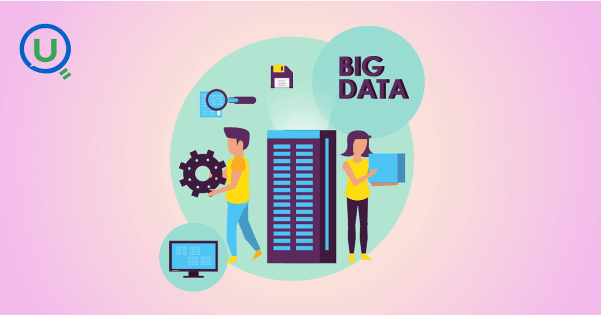
Big Data refers to large, complex data sets generated at high speed from various sources. It plays a crucial role in business, healthcare, finance, education, and more, enabling better decision-making, predictive analytics, and innovation.

Discover the power of prompt engineering and how it enhances AI interactions. Learn the key principles, real-world use cases, and best practices for crafting effective prompts to get accurate, creative, and tailored results from AI tools like ChatGPT, Google Gemini, and Claude.

Learn what a Logical Data Model (LDM) is, its key components, and why it’s essential for effective database design. Explore how an LDM helps businesses align data needs with IT implementation, reducing errors and improving scalability.

Discover the power of a Canonical Data Model (CDM) for businesses facing complex data integration challenges. Learn how CDM simplifies communication between systems, improves data consistency, reduces development costs, and enhances scalability for better decision-making.

Discover the 10 essential benefits of Engineering Data Management (EDM) and how it helps businesses streamline workflows, improve collaboration, ensure security, and make smarter decisions with technical data.

Explore how vibe coding is transforming programming by blending creativity, collaboration, and technology to create a more enjoyable, productive, and human-centered coding experience.

Learn how Azure Databricks empowers data engineers to build optimized, scalable, and reliable data pipelines with features like Delta Lake, auto-scaling, automation, and seamless collaboration.

Explore the top 10 data science trends to watch out for in 2025. From generative AI to automated machine learning, discover how these advancements are shaping the future of data science and transforming industries worldwide.

Discover the key differences between data scientists and data engineers, their roles, responsibilities, and tools. Learn how Enqurious helps you build skills in both fields with hands-on, industry-relevant learning.

Discover the 9 essential steps to effective engineering data management. Learn how to streamline workflows, improve collaboration, and ensure data integrity across engineering teams.
Azure Databricks is a cloud-based data analytics platform that combines the power of Apache Spark with the scalability, security, and ease of use offered by Microsoft Azure. It provides a unified workspace where data engineers, data scientists, analysts, and business users can collaborate.

In today's data-driven world, knowing how to make sense of information is a crucial skill. We’re surrounded by test scores, app usage stats, survey responses, and sales figures — and all this raw data on its own isn’t helpful.

In this blog, we will discuss some of the fundamental differences between AI inference vs. training—one that is, by design, artificially intelligent.

This guide provides a clear, actionable roadmap to help you avoid common pitfalls and successfully earn your SnowPro Core Certification, whether you’re making a career pivot or leveling up in your current role.

"Ever had one of those days when you’re standing in line at a store, waiting for a sales assistant to help you find a product?" In this blog we will get to know about -What is RAG, different types of RAG Architectures and pros and cons for each RAG.

Discover how Databricks and Snowflake together empower businesses by uniting big data, AI, and analytics excellence

How do major retailers like Walmart handle thousands of customer queries in real time without breaking a sweat? From answering questions instantly to providing personalized shopping recommendations, conversational AI reshapes how retailers interact with their customers.